
EasyPeasy
.png)
Project Overview:
I joined my university’s UX Club and this year we had a UX Design challenge! I participated within a group! Our challenge was defined as follows: Design a mobile application that teaches students easy, budget-friendly and delicious recipes.
EasyPeasy is an app that focuses on the needs of students of various backgrounds and interests when it comes to cooking. College students are notorious for neglecting their health and nourishment. This app was designed with the busy, frugal, and picky college student in mind. it's Easy Peasy Lemon Squeezy!
Hitha G.
Mia T.
Natalie S.
2 weeks
Research, Research, Research:
What is design without research-based decisions? First, we put ourselves in the user’s shoes. After all, as busy college students we are the users. We created an empathy map to put our thoughts in an chaotic organization of words and phrases we feel the user does, thinks, feels, and says.
.png)
Empathy Map
We took our research a step further by creating a survey for students to gauge what students need when it comes to creating a recipe app. We got 20 responses that had quite similar answers. Repeating words were cost, time, and quality.
Our Research Questions:
-
If you generally cook, how much time do you spend cooking in a given day? (enter N/A if you do not cook)
-
If you do not generally cook, how much time do you spend finding a place to eat? (enter N/A if you do cook)
-
If you cook, what are your top 3 priorities when cooking? If you do not cook, what are your top 3 priorities when getting food?
-
How has college affected your food choices? (whether positively or negatively)
-
If you do not cook, what would make you want to cook? (enter N/A if you do cook)
-
If you cook, what is your approximate monthly budget for groceries? If you do NOT cook, how much do you spend on food each month?
-
When searching for a recipe, what are you looking for?
-
Do you have any dietary restrictions (religious, allergy, etc.) ? If so, how does this impact your food choices?
-
What are looking for in a food app? (Ubereats, Doordash, Food network app etc) Please elaborate.
Data Analysis + Actions We Took
-
A lot of college students simply do not cook at all and eat out instead because of lack of time. This conclusion led us to spend more time on making the app efficient by using straightforward, simple set up and viewing for the user.
-
Most people were concerned with calorie count and health so we implemented a calorie counting feature + links to My Fitness Pal (with the option to turn it off if needed) on our app.
-
College has overwhelmingly negatively impacted college students’ relationship with food overall. We used positive, affirming language throughout the app to motivate users to take care of their health and nutrition. We implemented a community feature that students can use to motivate and help each other to eat better.
-
The answers to question 7 alluded to the fact that a lot of college students just don’t know how to cook and never were taught simple meals. With this data in mind, we really focused on simplicity and video tutorials for basic cooking skills like how to use a knife.
Ideation (The Pillars):
1. Alterable
With so many different types of students with different needs, we wanted to make sure that students are able to change any settings easily through our ChatBot, Squeezy. For example, turning off the calorie count if needed or choosing only Halal options.
.png)

2. Simplicity
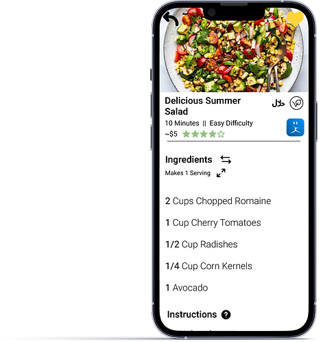
The last thing we wanted to do was to overwhelm the user, especially when our survey showed how overwhelmed students felt when approaching cooking in general. We used simple graphics and navigation in an effort to make everything as easy as possible for the user. We made the hamburger menu and recipe page straightforward for the user with a simple color scheme.
.png)
.png)
3. Community
The power of connection and food is undeniable. We put an emphasis on community through the use of a “Student Feed” where students are able to share and communicate about different recipes.
.png)
Flowing:
We created a user flow to help us navigate the needs of our users and to help us understand how we can put these needs into actions that the users can take.
.png)
The User Journey:
We put ourselves back into the user’s shoes to understand the emotions that the user would go through while navigating our app. After all, what is UX without trying to understand the emotions of people?

Wireframing:
Then we got to work by creating the first wireframes. As we created the wireframes, we found that there were so many aspects that we did not account for in the user flow. The wireframes helped us understand how much goes into creating and refining.
.png)
Wireframing:
Here is the app in action!

Reflecting..:


